
hi!
Its been so long since I last drawn anything and I wanted to make the 100 and 1 time starting to draw from 0 in to a fun series of post ( its more for me coss I always said I ll gonna do it but I never type nothing :/ )
I m going to start from 0, fuck clip studio and the crashes that corrupt 5 minutes of animation, fuck photoshop and its ram munching we going in to Krita.
How do u guys study composition?
After reading lots of books and stuff I came to the conclusion that paintings/drawings are composed by 2 parts:
the negative and positive spaces
the negative space according to Wikipedia is empty space around and between the subject(s), not the subject itself, forms an interesting or artistically relevant shape so to me its that the spaces are the separation of artistically relevant shapes in a image/idea/scene
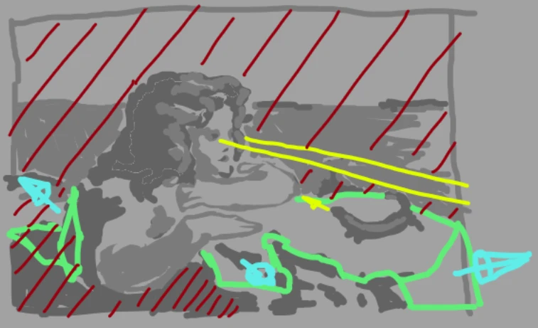
the tone/value map:
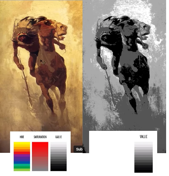
shapes in an image/idea/scene aren't always delimited by lines or color, but they seem to be delimited by the difference in value/tone of the color (this is not directly the light of the scene, it can be but there are more factors in it) and the panther made by the grouping of those values/tone
One influences the other, the tone map need the space to delimitate shapes and forms of its values and the space needs the value to segregate the content of an image/idea/scene in to spaces
This might not be right but I like to see it this way :)
it seems that we prefer those artistically relevant shapes or at least that could be one way to interpret the Law of Pragnanz. Assuming that s right then we can say that grouping shapes in a meaningful way lead to a more interesting composition.
In practice?
(I m dum ://// and i been doing homework on it for a while, but i never seem to get a nice grasp on it)
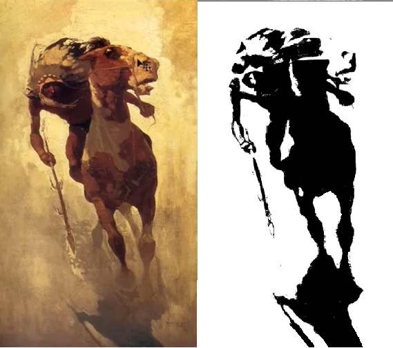
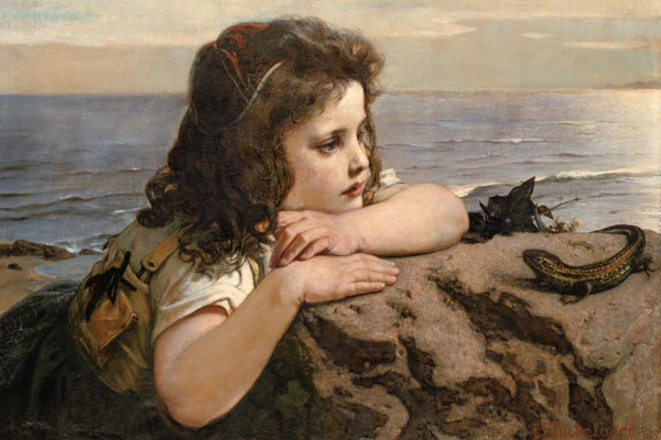
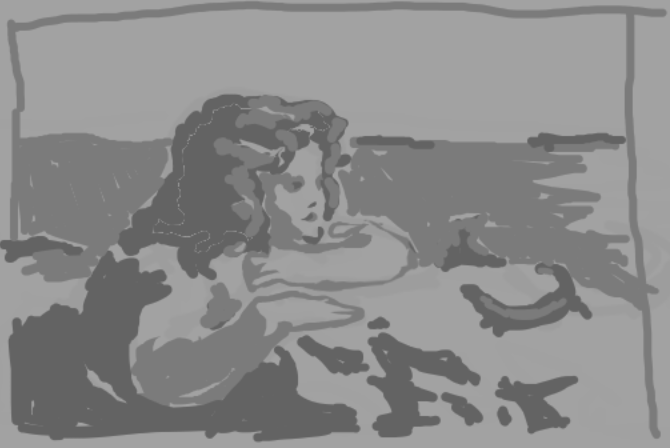
I saw this in a book shop the other day and wanted to do a "study":
The Girl with the Lizard (1884)
[Ernst Stückelberg](https://artvee.com/artist/ernst-stuckelberg/)
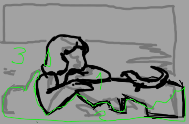
first the black lines as the main focal points
(i know the it ugly, I use the gray lines to delimit the main separation of tones and patterns inside of the spaces and the black lines to delimit the negative and positive space in the frame)
At a fist glance I took the girl and the lizard as the main focal points of the painting but the negative space didn't seem right :
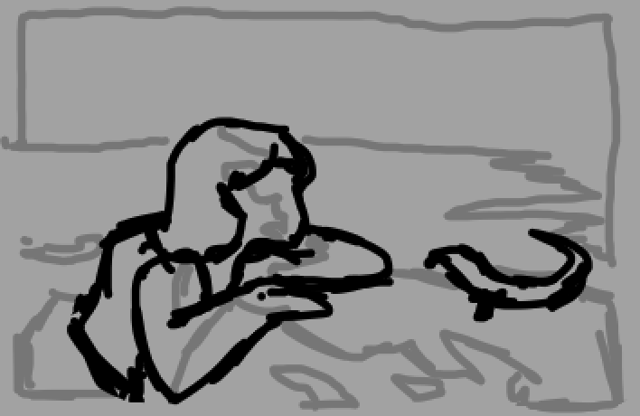
Then I saw the side of the rock and the girl not looking directly at the lizard and got the impression that this was like a photo took rly close to the girl as if the camera was focus on the surface of the rock where the girl is resting her hand
So I join the rock and the negative space made more sense, there are 3 layers of "focus" the main one, the near one an the background if i do that:
ps: the framing
I cant put my finger on it but the framing is interesting, from what I can remember in most places they tell u that your goal is to keep the eyes of the viewer inside of the frame but to me, most element of the painting imply that this is a part of a bigger picture, the girl looking away, the reflection of the sun the focal point so near the edge. I don't know, i like how it looks
the tone/value map
since the shapes of a drawing are compose of patterns and values, I like to make a tone map after delimiting the spaces in the drawing (this way its easier to merge shapes, the Law of Pragnanz and all of that dark magic stuff):
Sooo, what can I take away from this?
so not guiding the eyes outside of the framing isn't always bad?
If it is deliberately made, it seems like it could work. Although I m too dense to parce what the dude wanted to say with the way the painting is frame the intend seem to be clear and works
eeeeee... this is a interesting way of making a focal point?
if a I wanted to make a painting of 2 things (me being stupid) I most likely would had made at least the 2 focal points in to separated shapes
and FUCK DEFAULT KRITA:
the default layout feels blotted to me, the color sampler and transform don't go back to the last tool that u where using once you are done using them ( if u apply a transform it means that I m done, same with the color one. It gets rly annoying to go back to the brush each time :/ )
this is a skill issue and i need to research more
TLDR
I always wanted to do a blog but never made it, so yea
any feedback is welcome, this is not the right way of doing stuff but the way I do it, I m still learning as I go :)